Feature Plot
Plot any variable in the cell and image feature lists provided in the Feature Plot. (Current version has only Histogram, Heatmap, Scatter Plot, and Violin + Strip available.)
Feature data must be extracted from the dataset in order to load the data into the plot. Make sure you run segmentation through the Segmentation window with Measure Cell Features and Measure Image Features checked to do so. You can also import existing feature data through the file menu, or run feature analysis on a separate segmentation mask (click here for details on importing segmentation masks).
Set a Data Source
Data source is where you can set the population of cells in the plot. By default, the data source is set to All Cells. To select from a different population, such as any gates or clusters you have applied, choose from the dropdown.
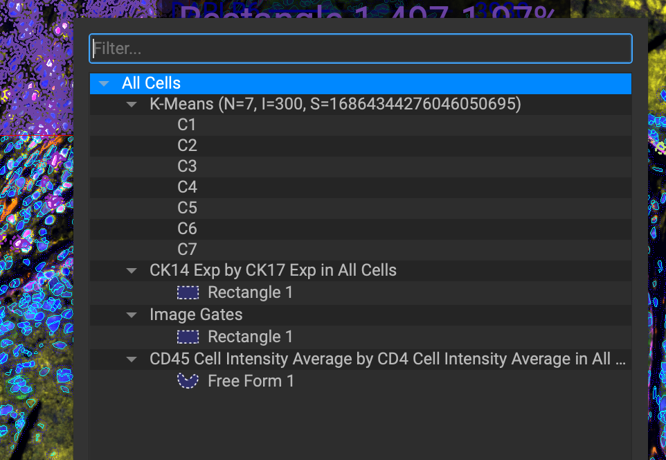
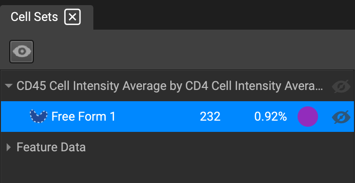
You can nest gates within each other, and alternate between feature plots from different data sources just by selecting them in the Cell Sets widget.
Plot Types
Histogram
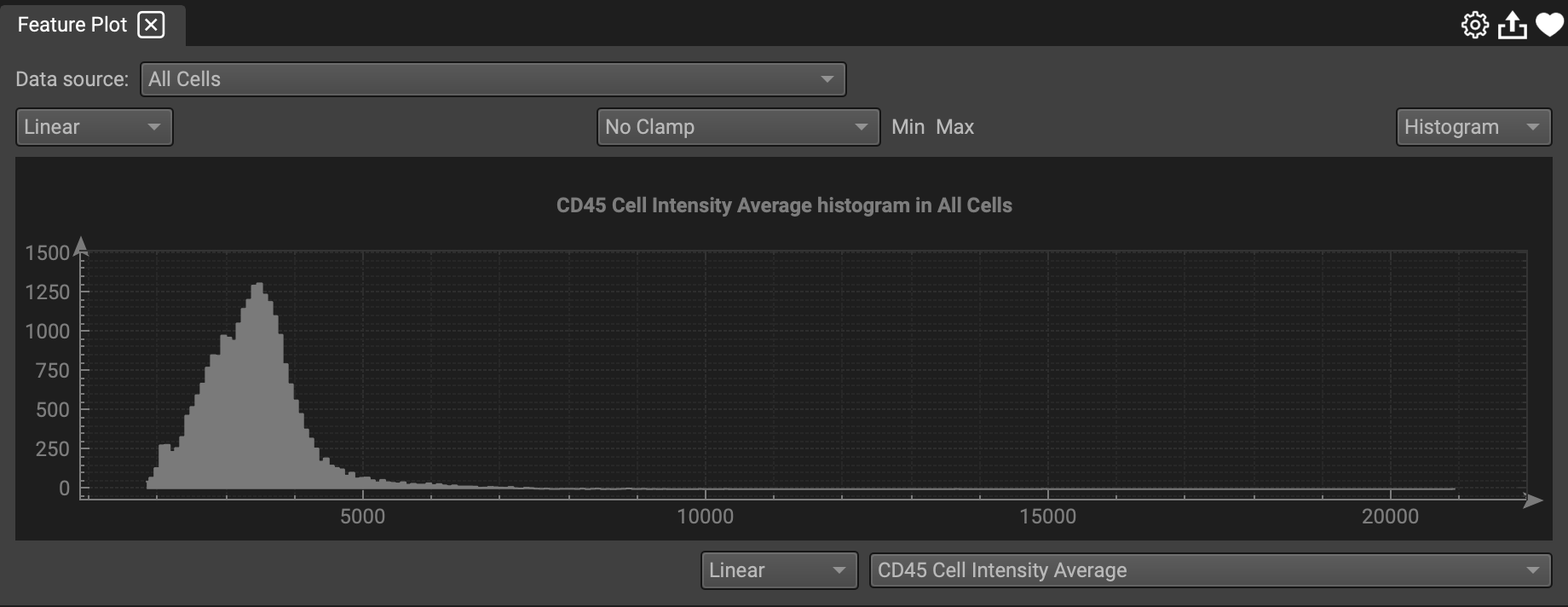
Select any feature variable to display in a Histogram plot. Once you have chosen a data source, select a feature and plot scale from the dropdown lists at the bottom.
You can apply a Clamp to the plot to filter the data range by selecting from the center-top dropdown.
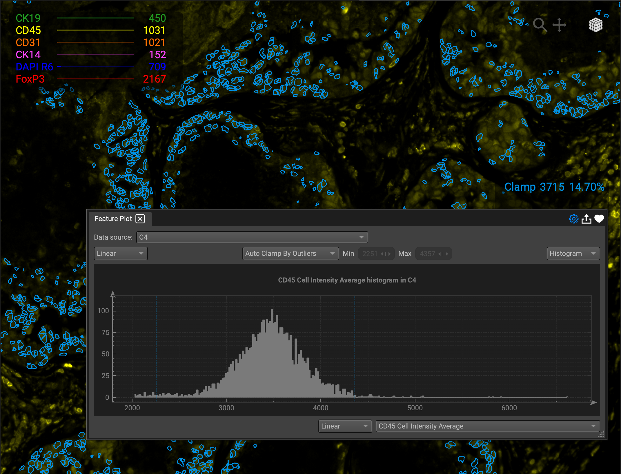
These options include:
Auto Clamp by Outliers
Auto Clamp by % (Adjust the % min and max)
Auto Clamp by Full Range
Manual Clamp (Set the clamp by dragging the colored lines)
No Clamp
Making a clamp will create a corresponding entry in the Cell Seleciton Overlays widget. Click on it at any point to display it in the Feature Plot widget. You can also toggle it on the image view display and change the color of the cell outlines.
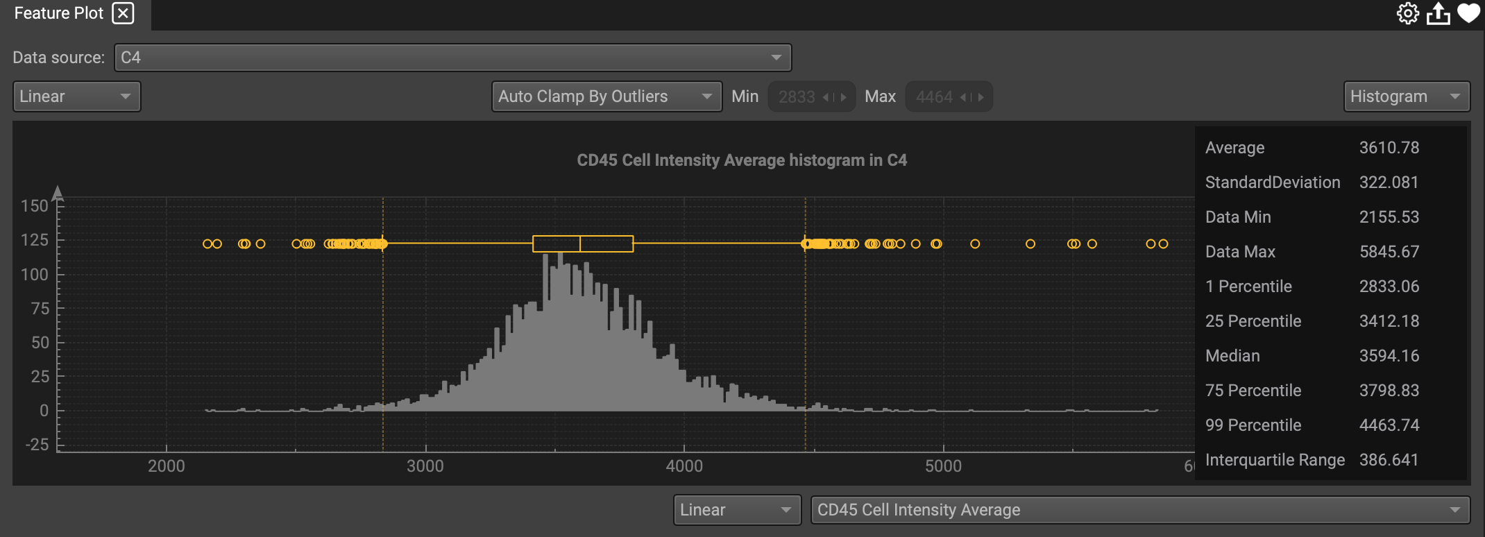
You can apply a clamp to all features in Histogram Settings by clicking on the gearwheel.
In Histogram Settings, you can also display a legend within the plot, as well as box plot whiskers (Right-click for shortcut).
For any plot, you can reset the axes if you pan or zoom off center, and toggle the line grid on or off. Right-click the plot to see these options as well.
You can change the plot type by selecting one from the dropdown list on the right.
Scatter Plot
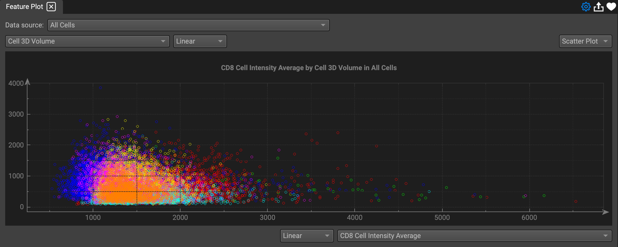
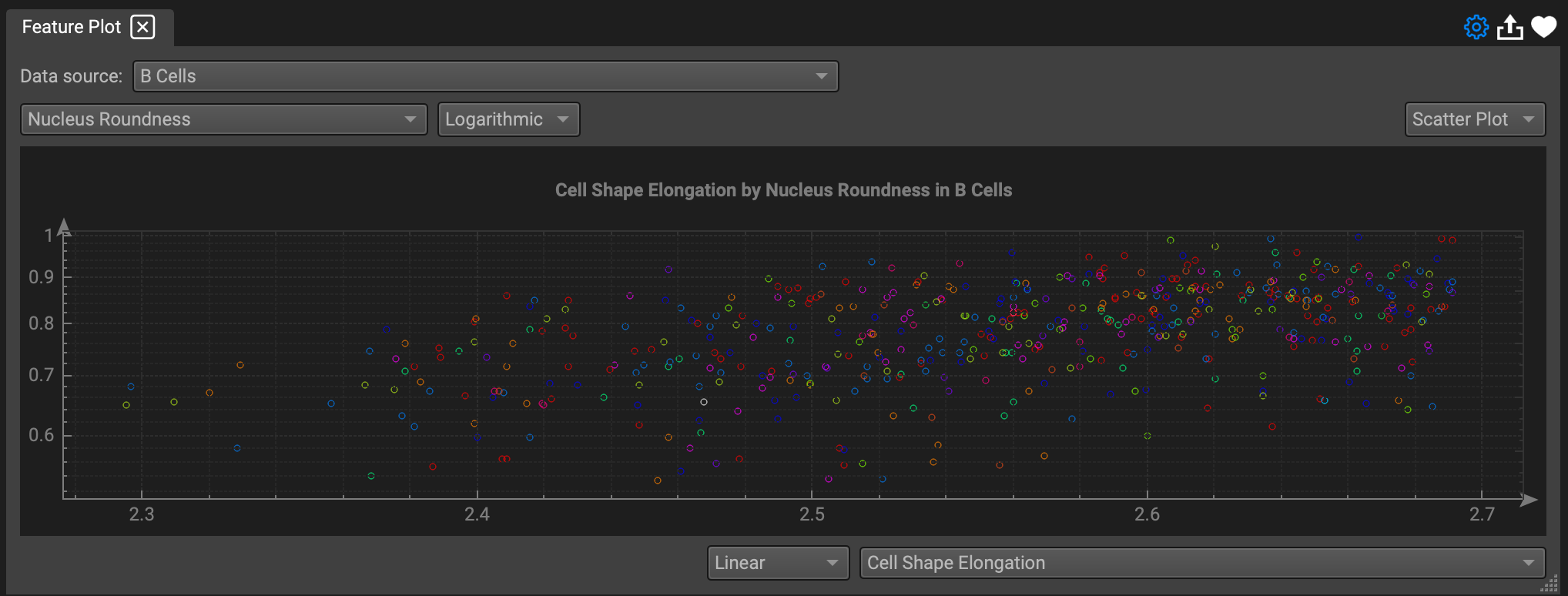
Select features for x and y axes to display in a Scatter Plot. Each cell represents a single data point and cell ID.
Selecting one point on a scatterplot will highlight the corresponding cell on the Image View, and vice versa (Click Fit Selected in the View Navigator to quickly zoom into the cell).
Heatmap
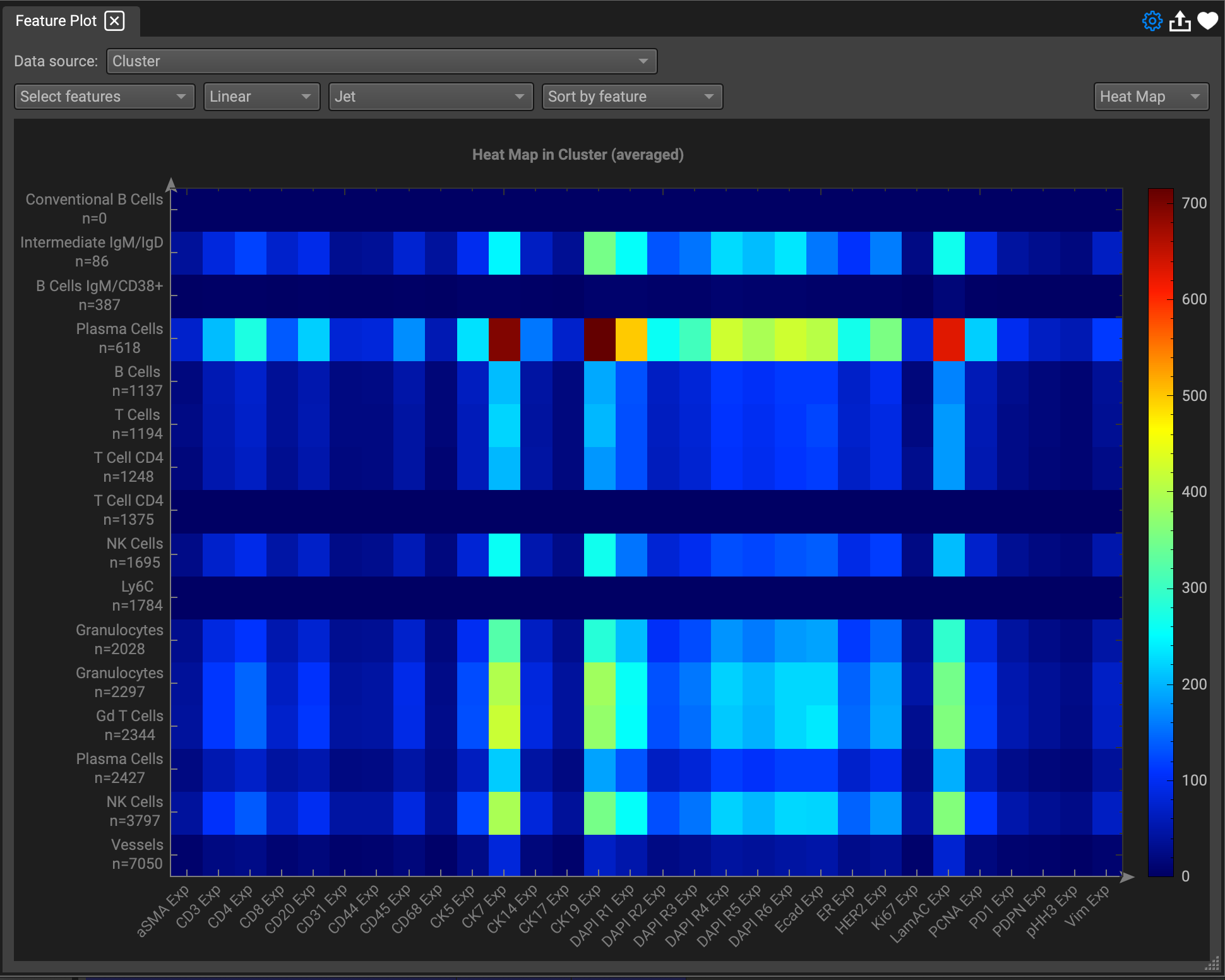
Select features from the dropdown list by checking the ones you want, then apply a color scheme. You also can sort the heatmap by a feature, just choose one from the Sort by feature dropdown.
You can switch the Heatmap orientation by clicking the Histogram Settings gearwheel and selecting Feature x Cell ID.
Other options in Histogram Settings include:
Apply a Clamp
Apply Z-score Normalization to Heatmap
Z-score (or standard score) describes the position of raw data with regard to its distance from the mean, when measured in standard deviation units. The z-score is positive if the value lies above the mean, and negative if it lies below the mean.
Apply Arsinh Normalization
Arsinh (or inverse hyperbolic sine), can correct for null of negative values, and treat differently small and high values.
Apply Averaging to Heatmap
Export a Plot
You can export a feature plot as a .jpg, .png, or .tiff by clicking the export icon on the top right.
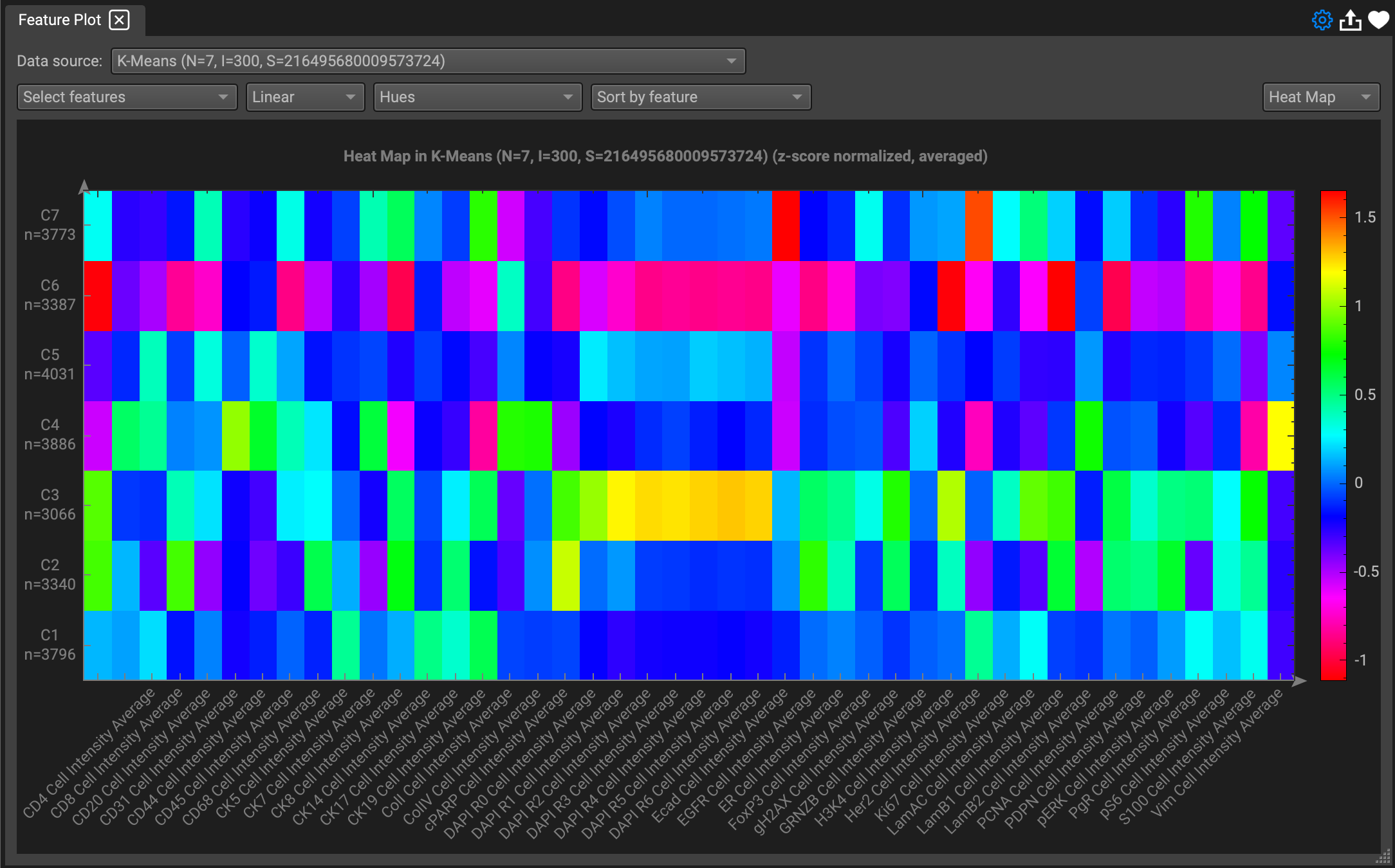
The default location is set to the Export folder, but you can choose any location when prompted by the dialogue.
Plot Favorites
Favorite a plot by clicking the heart icon on the top right to save it. You can add as many plots as you would like to favorites.
To delete one from favorites, Select Delete favorite and choose the plot from the dropdown that you'd like to remove.
Apply t-SNE/UMAP and K-Means Clustering
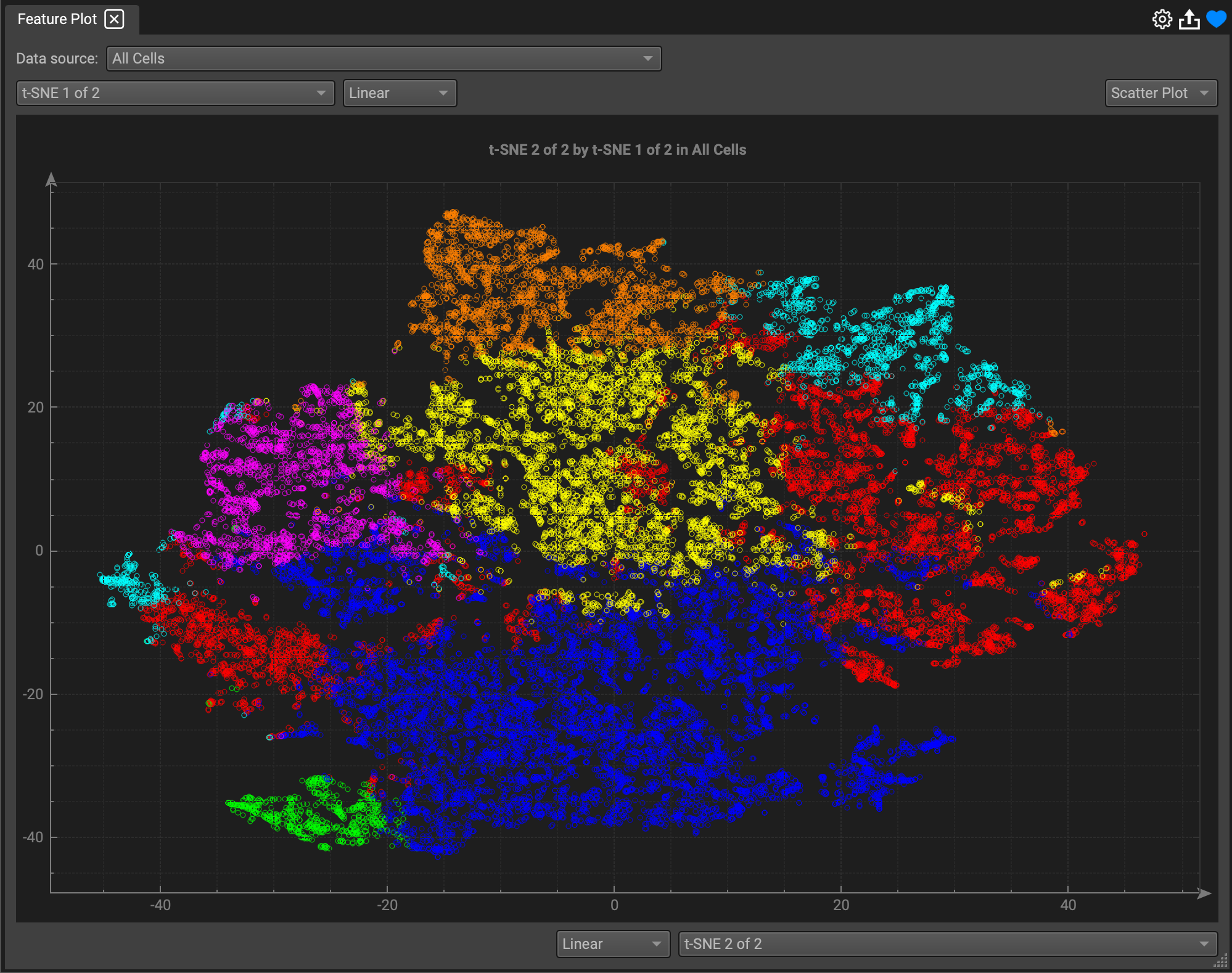
To view a t-SNE or UMAP on a plot, first select the function in the gearwheel to apply it to your selected features in the Feature Table. In this example, we'll apply t-SNE to the feature expression for each biomarker that is checked. QiTissue will generate columns for the number of output dimensions input into the dialogue when prompted (default is 2).

Create a new tab at the bottom by clicking the (+). Check the t-SNE generated outputs as feature columns in the new table.
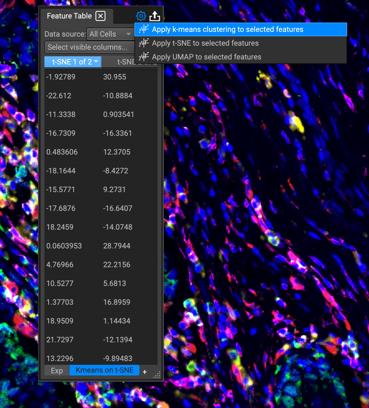
Then select the option to apply K-Means clustering to the t-SNE and choose the number of clusters to output when prompted by the dialogue (default is set to 5).
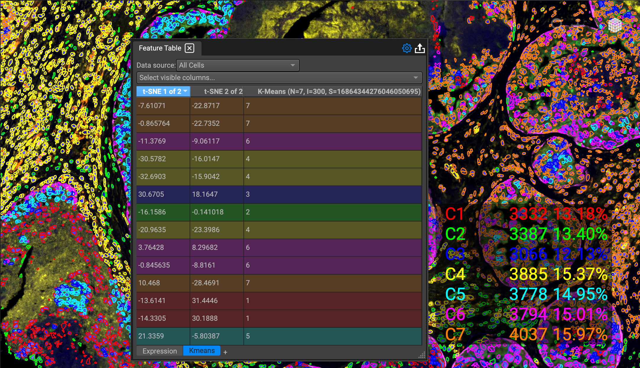
Switch back to the Feature Plot and select t-SNE as the Scatter Plot axes.
