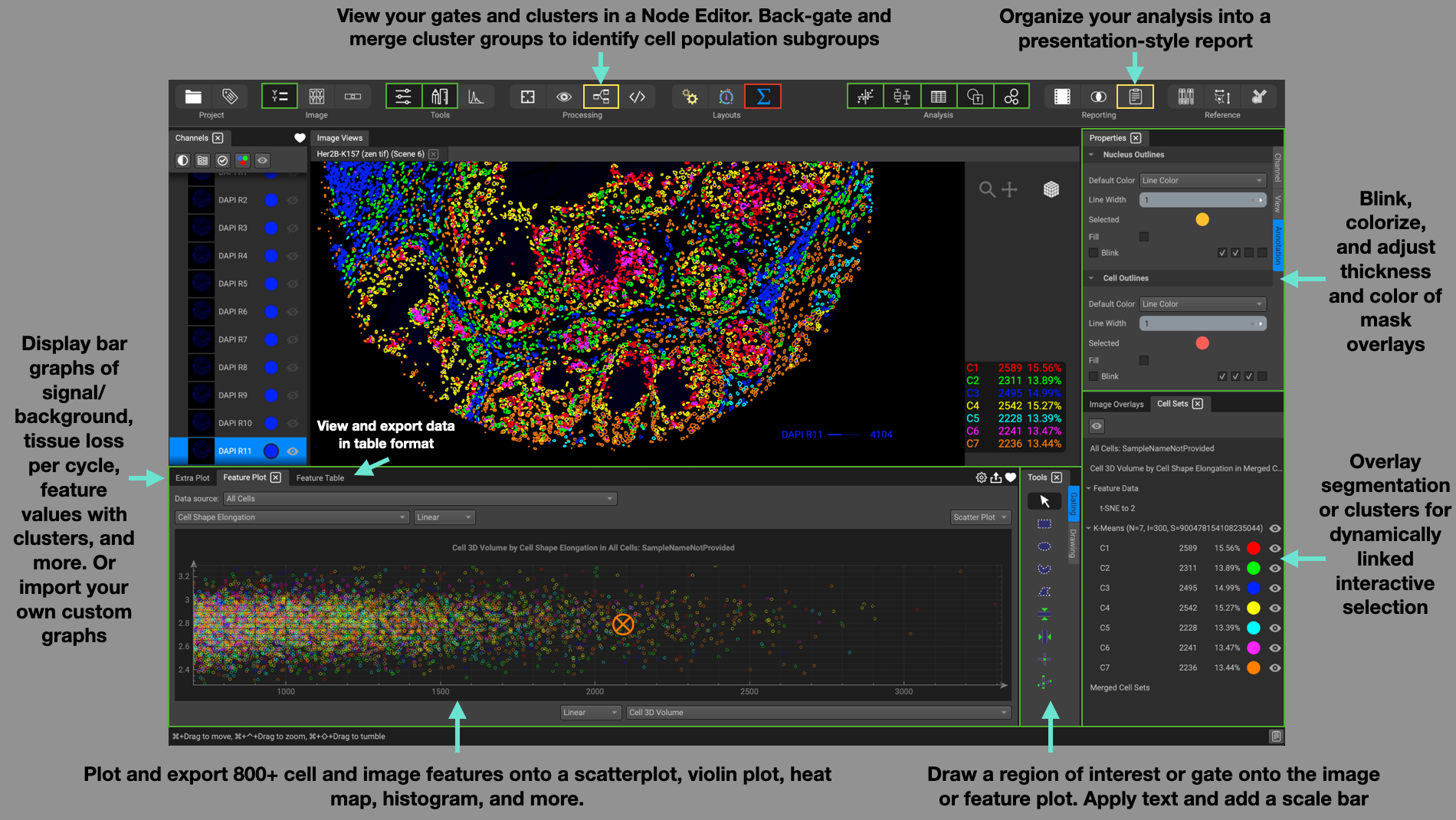
Using the Workflow Layouts, or Personas
The three icons at the center-top of the interface are the layout configurations. These are preset interface layouts that are helpful when performing specific tasks. QiTissue has these tasks organized into three different workflows: Processing, Visualization, and Analysis.
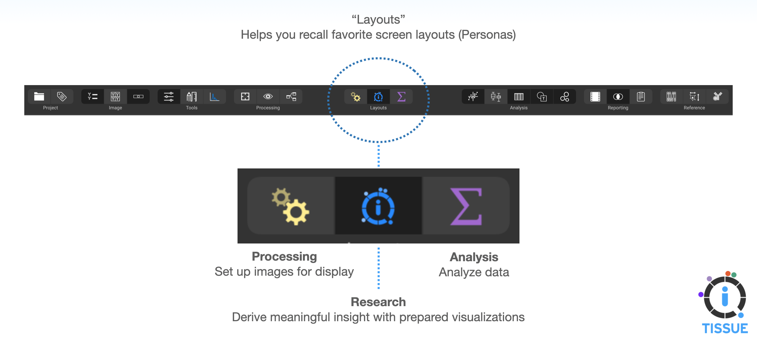
Additionally, QiTissue automatically remembers configurations set on different monitors. If you switch between working on a laptop and a separate monitor with more screen space, both configurations are remembered and saved separately, providing a convenient way to effectively use your screen space.
Processing Layout
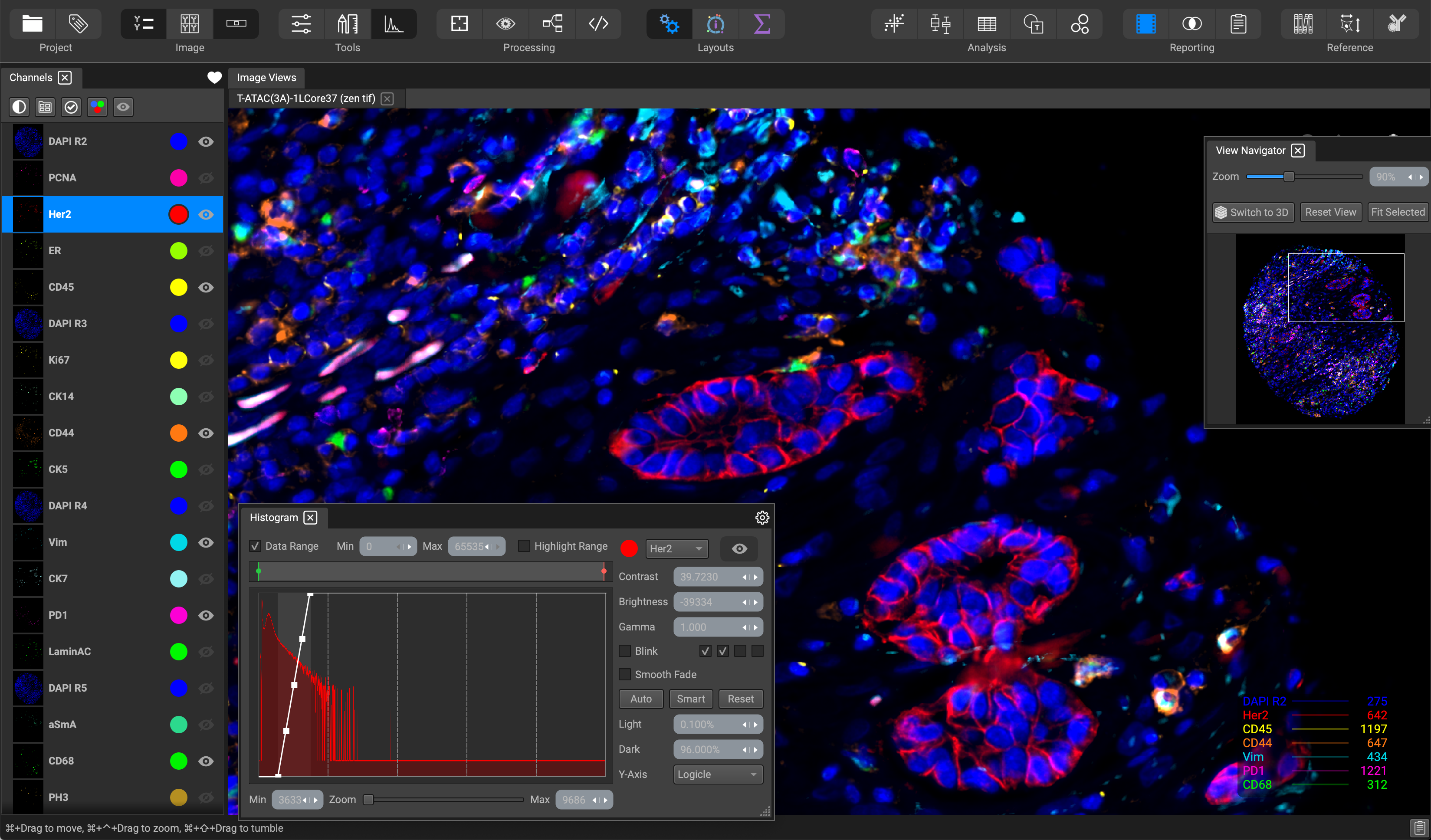
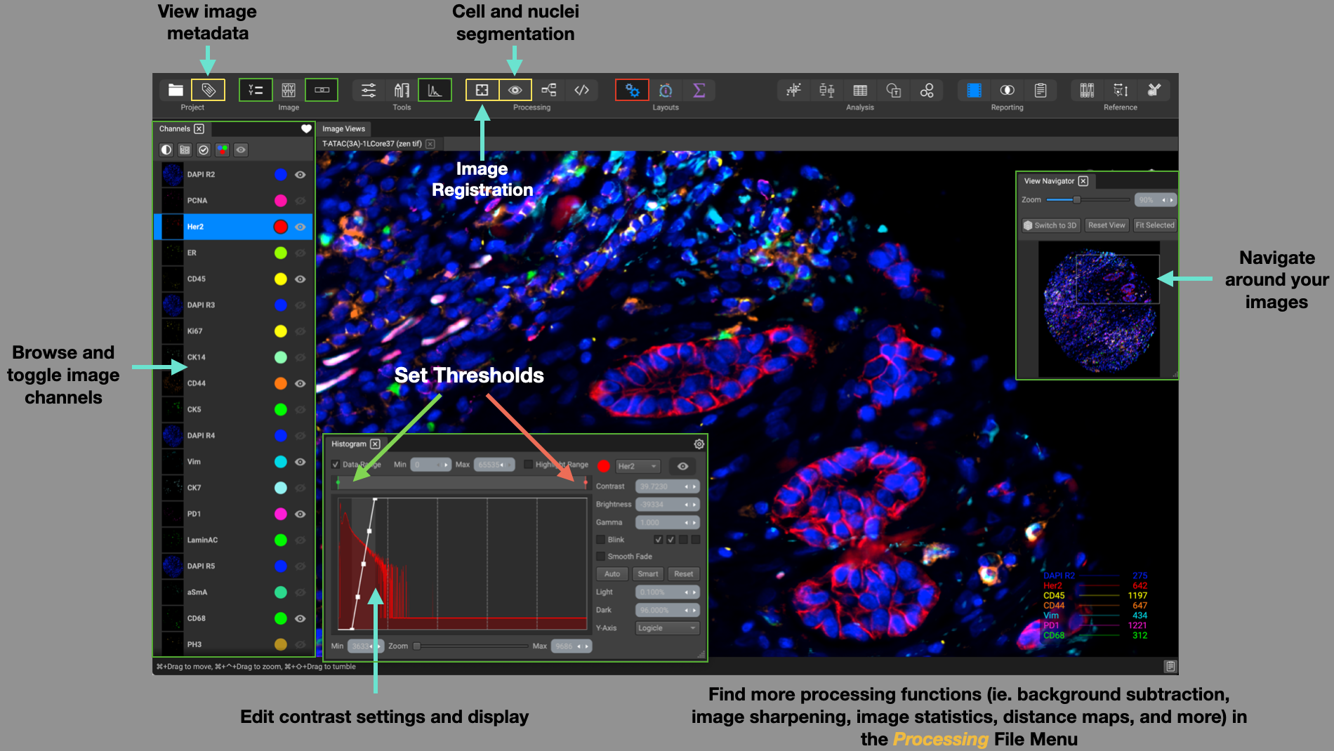
The Processing layout is organized to help with tasks immediately after uploading a dataset from the Project Browser. The widgets are arranged for processing tasks and image channel adjustment for optimal visualization of your datasets. Browse through and toggle image channels on the left-hand side using the Channels List, where they will display in the Image Views at the center of the screen.
The View Navigator widget in the top-right of the screen shows an overview of the entire image, which can be used to adjust the field of view, in addition to the navigation controls in the Image Views.
You can adjust contrast and display settings to all of your channels within the Channels List. To adjust a single channel at a time, specify the channel in the dropdown and slide the histogram curve in the Histogram widget located at the bottom of the screen. You can change contrast, brightness, and gamma settings, set channel blink effects, and data range thresholds.
Additional widgets and functions that are useful to incorporate in this layout is the Image Metadata column table, Channel Registration, Cell and Nuclei Segmentation, and processing-related computations and statistics (ie. background subtraction, image sharpening, monadic/dyadic operations, channel correlation matrix, etc.) which can be found in the Processing file menu.
Visualization Layout
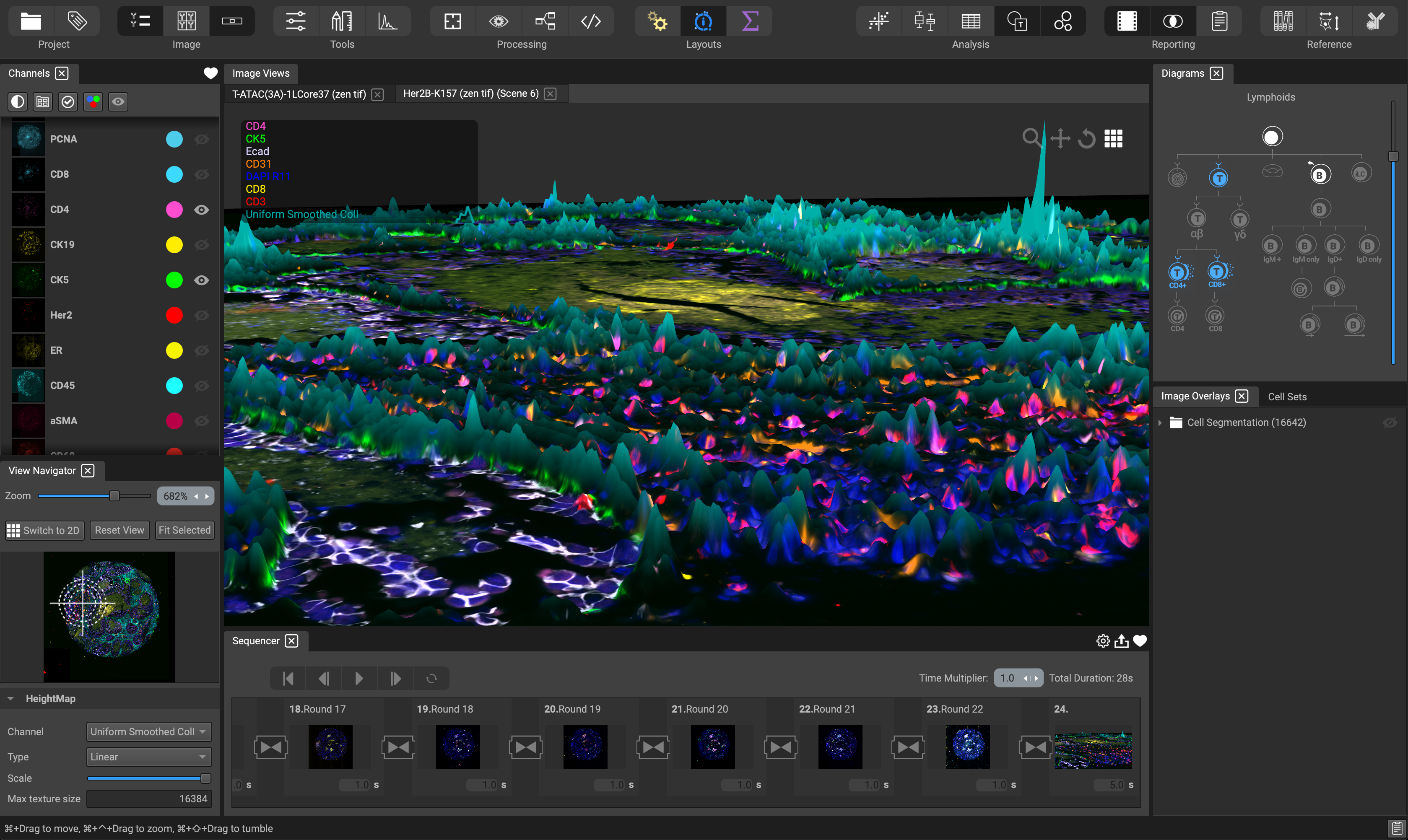
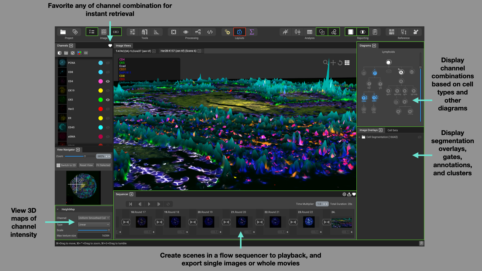
The Visualization layout is set up to help with tasks for visualizing your data. Use the Channel List on the left-hand side to create different channel combinations, or perspectives, and favorite them using the heart icon for instant retrieval.
In the lower portion of the View Navigator, specify which channel you would like to use as the HeightMap (biomarker intensity translated into a scalable height) for display in 3D mode. Adjust the type (linear, logarithmic, logicle), and scale of the HeightMap.
Create different scenes in the Flow Sequencer at the bottom of the screen. A scene can consist of an image in 2D or 3D and incorporate channel blinking and programmable scene duration. The result can be favorited for instant recall and exported as a collection of images or a movie with animated transitions and looping.
Use the Diagrams widget in the top-right corner to display channel combinations based on cell types, cell architecture, cancer hallmarks, and more. Simple click on an icon to display the associated channels.
Display segmentation masks, regions of interest, and user annotations in the Image Overlays widget, as well as image gates and cluster groups in the Cell Sets widget.
Analysis Layout
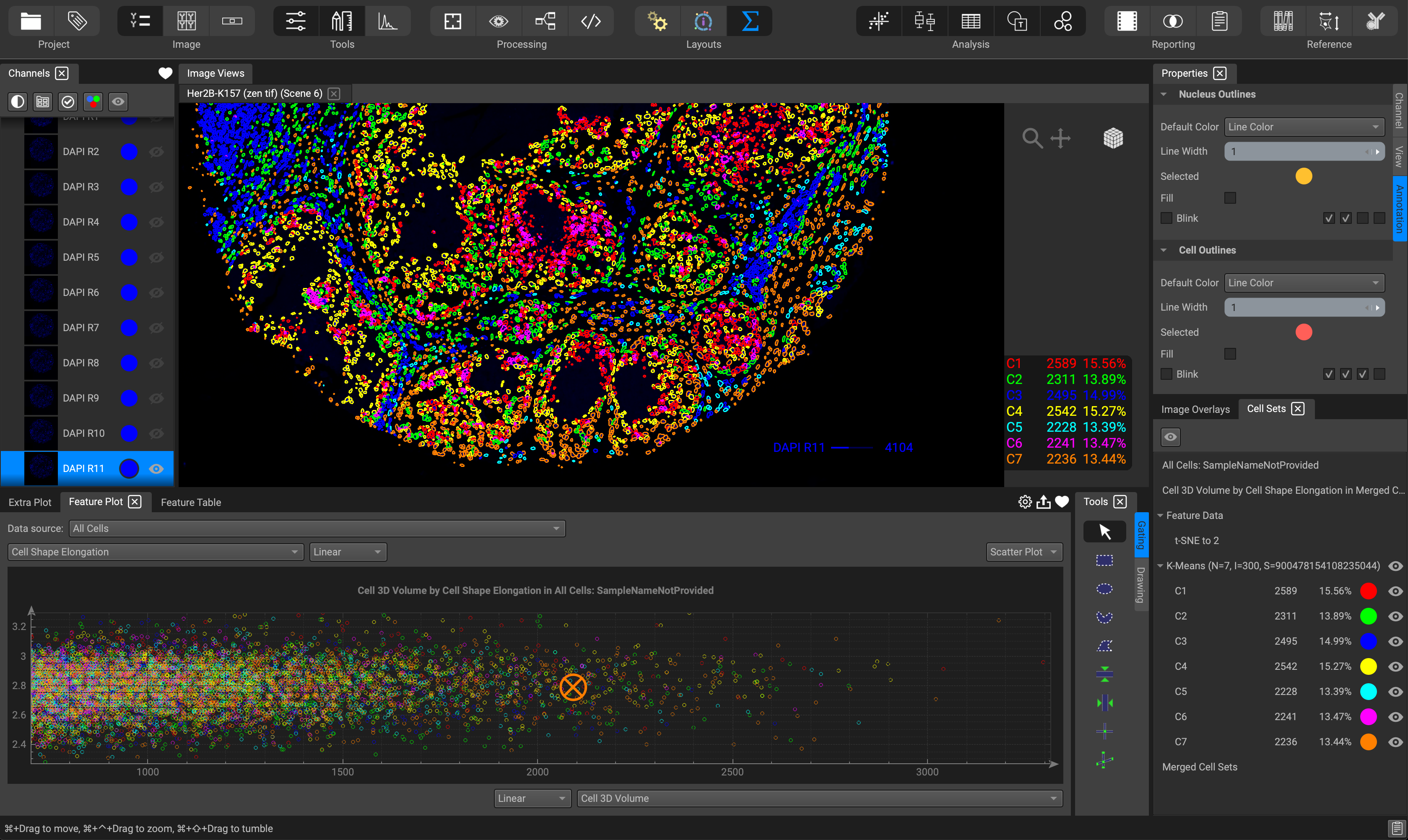
The Analysis layout is suited for dynamic interaction with your analysis results. View feature measurements in the Feature Plot located at the bottom. Choose between a scatter or violin plot, histogram, heat-map, and more. Or view your data in table format by selecting the Feature Table, situated as a tab within the Feature Plot widget. Gating on the Feature plot or the image itself will highlight the respective data cells within the other. Clicking on the Extra Plot tab provides additional bar graph options.
The Tools window directly beside the Feature Table provides the user with a myriad of annotation tools for drawing regions of interest to segment, gates for selecting cell subpopulations of interest, and text or scale bars. Gates can be applied on both the image itself as well as the Feature Plot.
Display cluster groups on the image and other cell subpopulations from gates or feature plots from the Cell Sets window located in the lower right-hand corner. Selecting a feature plot title will recall the plot in the Feature Table window.
Adjust parameters such as color, line width, blink beat intervals, in the Properties panel located in the top right-hand corner. Simply click on a specific image channel or annotation to reveal its respective parameters in this window.
View your gates and clusters in the form of nodes in the Node Editor widget to map a visual representation of your cell subpopulations.
Organize your analyses in the form of a presentation-style report using the Dataset Report widget.
