
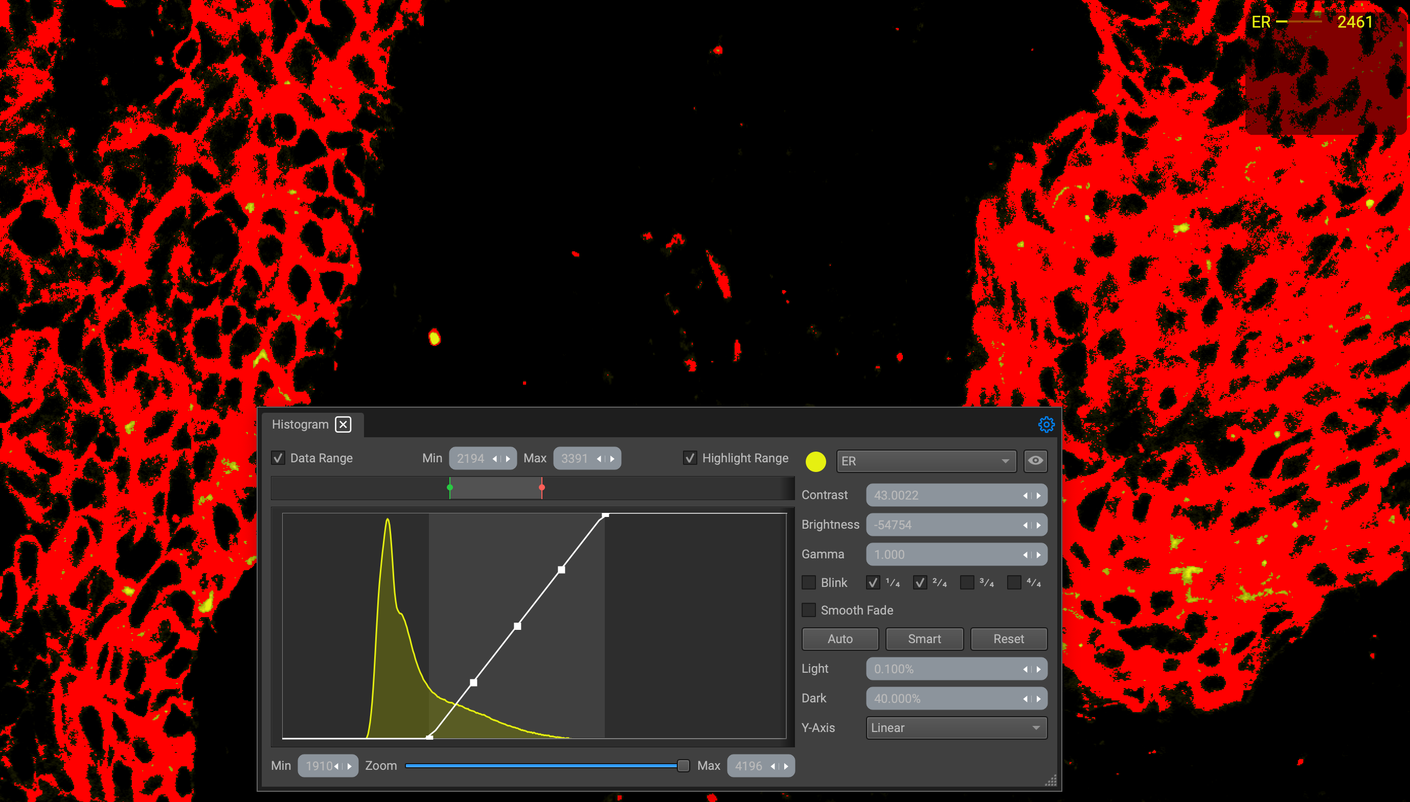
Histogram
Image Display Settings
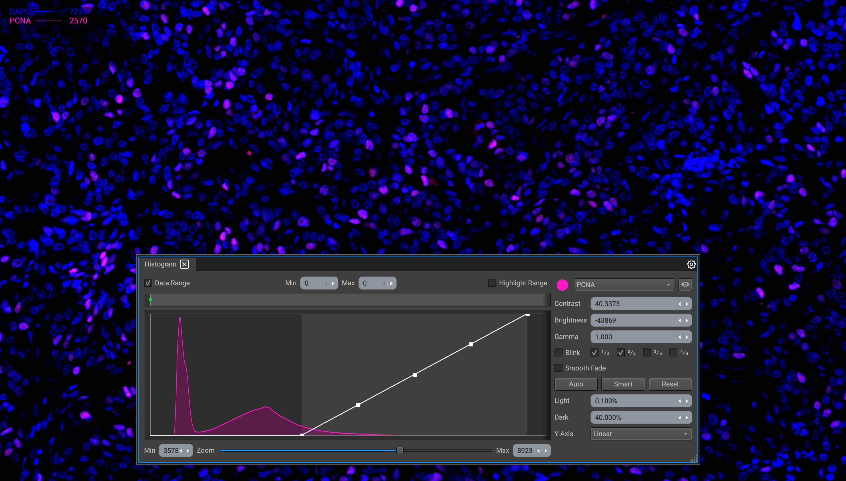
Control of the image channel display is done primarily through the histogram window. The objective is to optimally display biomarker channels that have widely different dynamics. Adjust the contrast, brightness, and gamma of the image by manipulating the histogram curve or by inputting values within the panel.
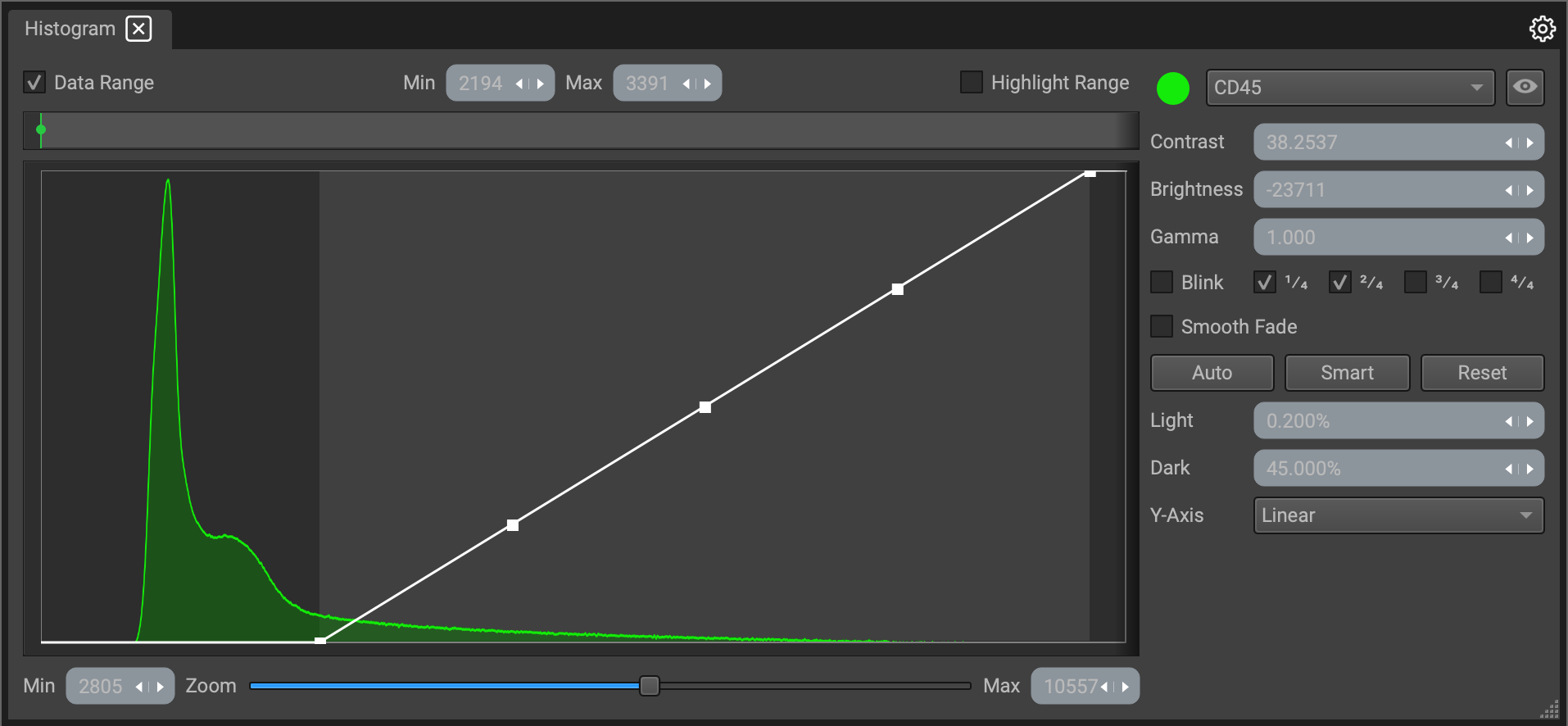
The image Histogram at the center of the widget graphs the tonal distribution of an image. The X-axis represents pixel intensity, with 0 is the lowest possible value and 65535 being the highest possible value in a 16-bit image. The Y-axis represents the number of pixels at each value. The scale of the X-axis can be set to linear, logarithmic or logicle. (Logicle provides the best visibility for low-intensity datasets.)
Features of the Histogram window include the following:
- Adjustable image and graph settings and other effects are located on the right-hand panel.
- Select a channel via the dropdown menu to be active and displayed.
- Toggle a channel on or off using the eye button. The color of the active channel can be changed, where the color also reflects the color on the graph.
- Minimum and maximum pixel intensity values are listed below the graph, with a zoom bar located at the bottom.
- Threshold ranges and highlight them (check the "Data Range" and Highlight Range" checkboxes above the graph) by dragging the red (minimum) and green (maximum) marks or inputting values directly above the graph.
Adjusting the Curve
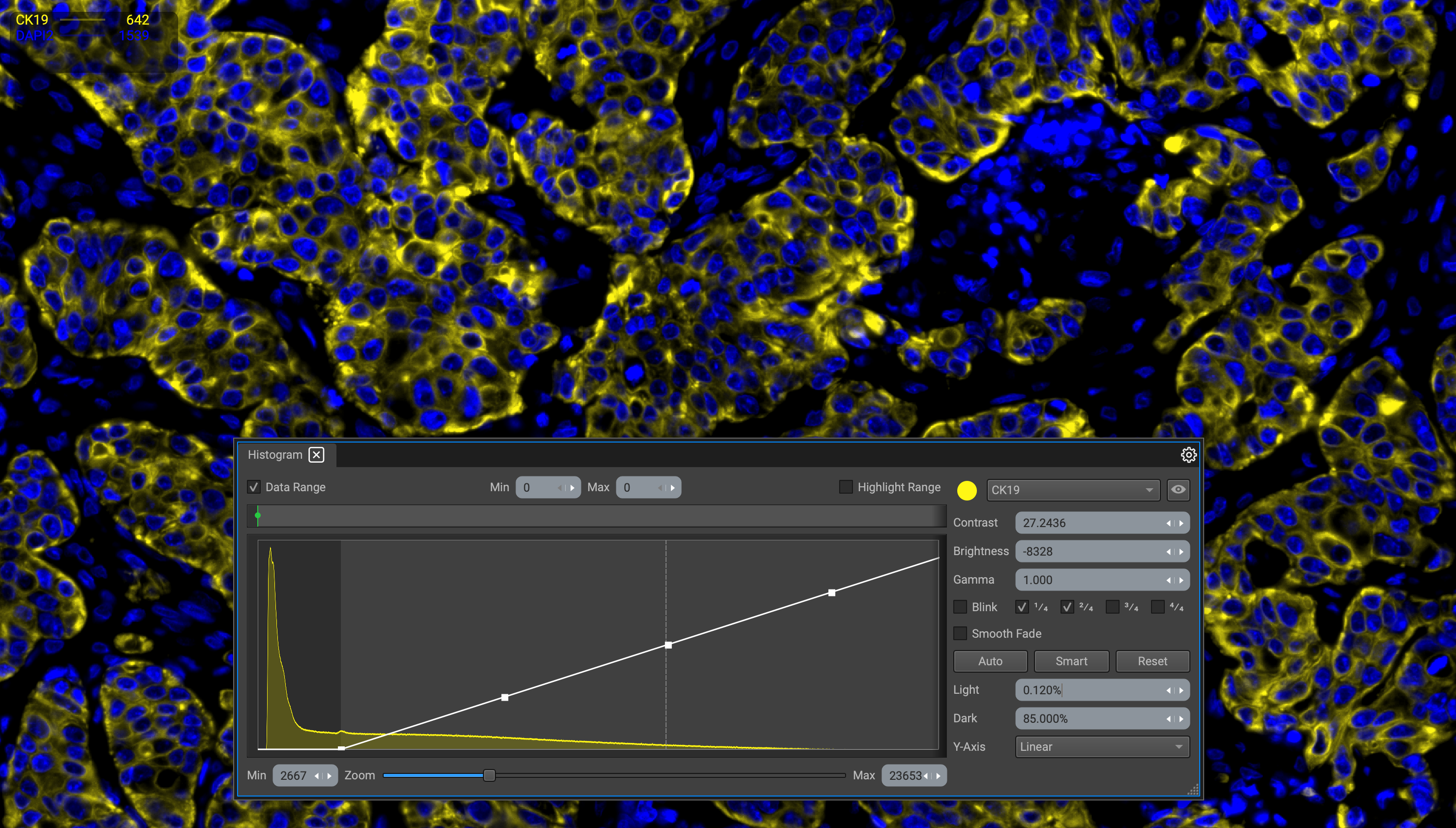
Contrast
Adjust the minimum and maximum pixel intensity values displayed in the image by sliding the endpoints of the curve.
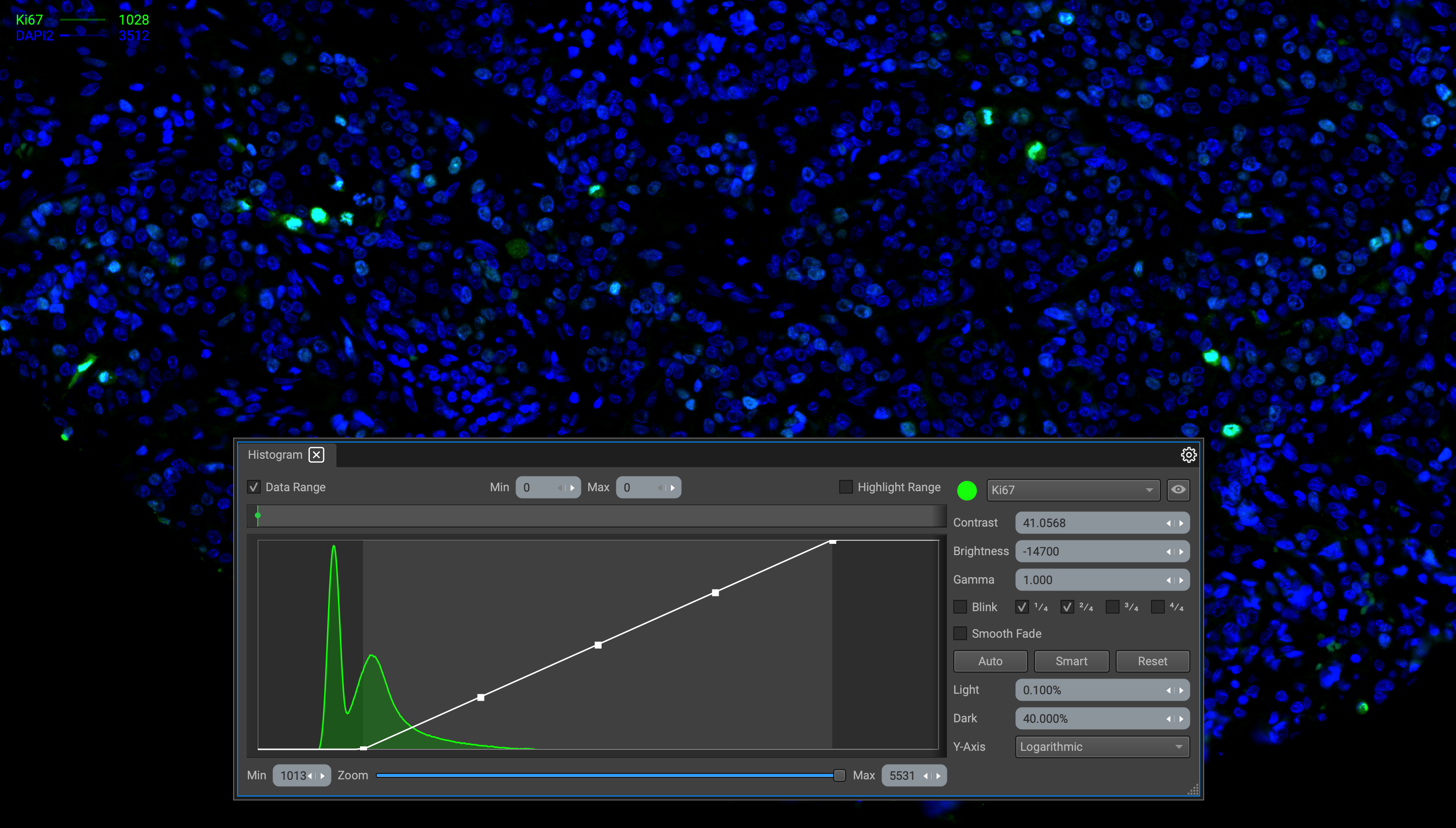
Dragging them will increase or decrease the "Min" and "Max" values located at the bottom of the histogram window. This will adjust the contrast and overall brightness. You can also enter values directly into the input box.
Brightness
To adjust the brightness, shift the range of the curve.
- Click and drag the center node on the curve to shift the range to the left or right.
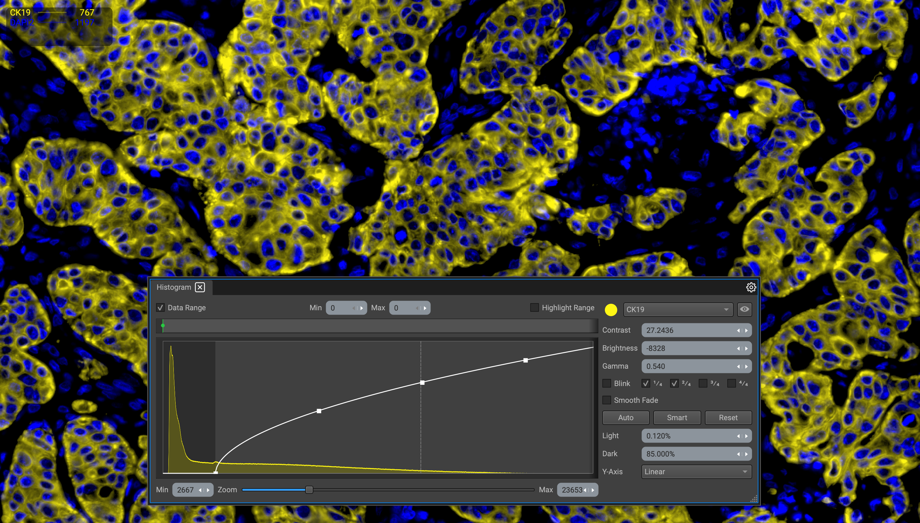
Gamma
Move the nodes adjacent to the center node to adjust the gamma.
- Bending the curve upward will decrease the gamma value, and bending it downward will increase it.
Remember, all display setting values can be input manually in their respective boxes, or increased/decreased by dragging the white arrows to the left or right.
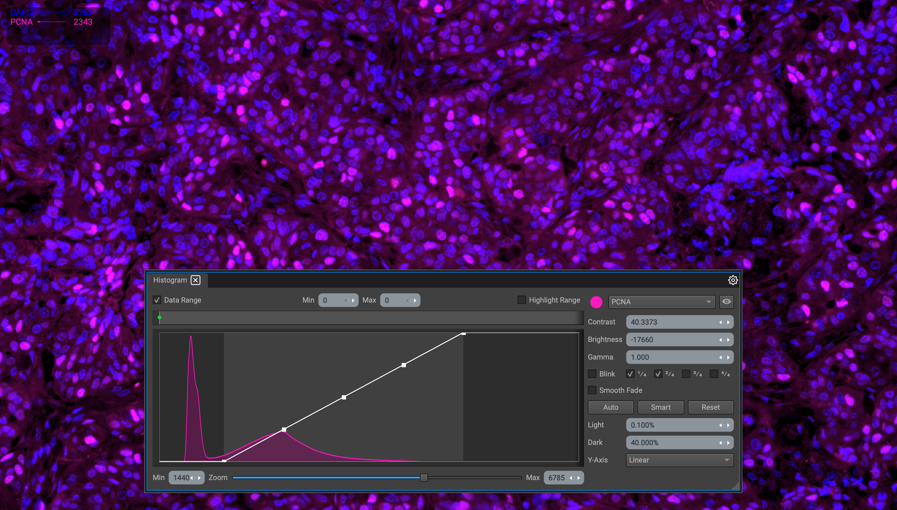
Hightlight a Data Range
While all of this can be done for thresholding, the Data Range and Highlight Range checkboxes provide a visual by highlighting pixels included within this range in red.
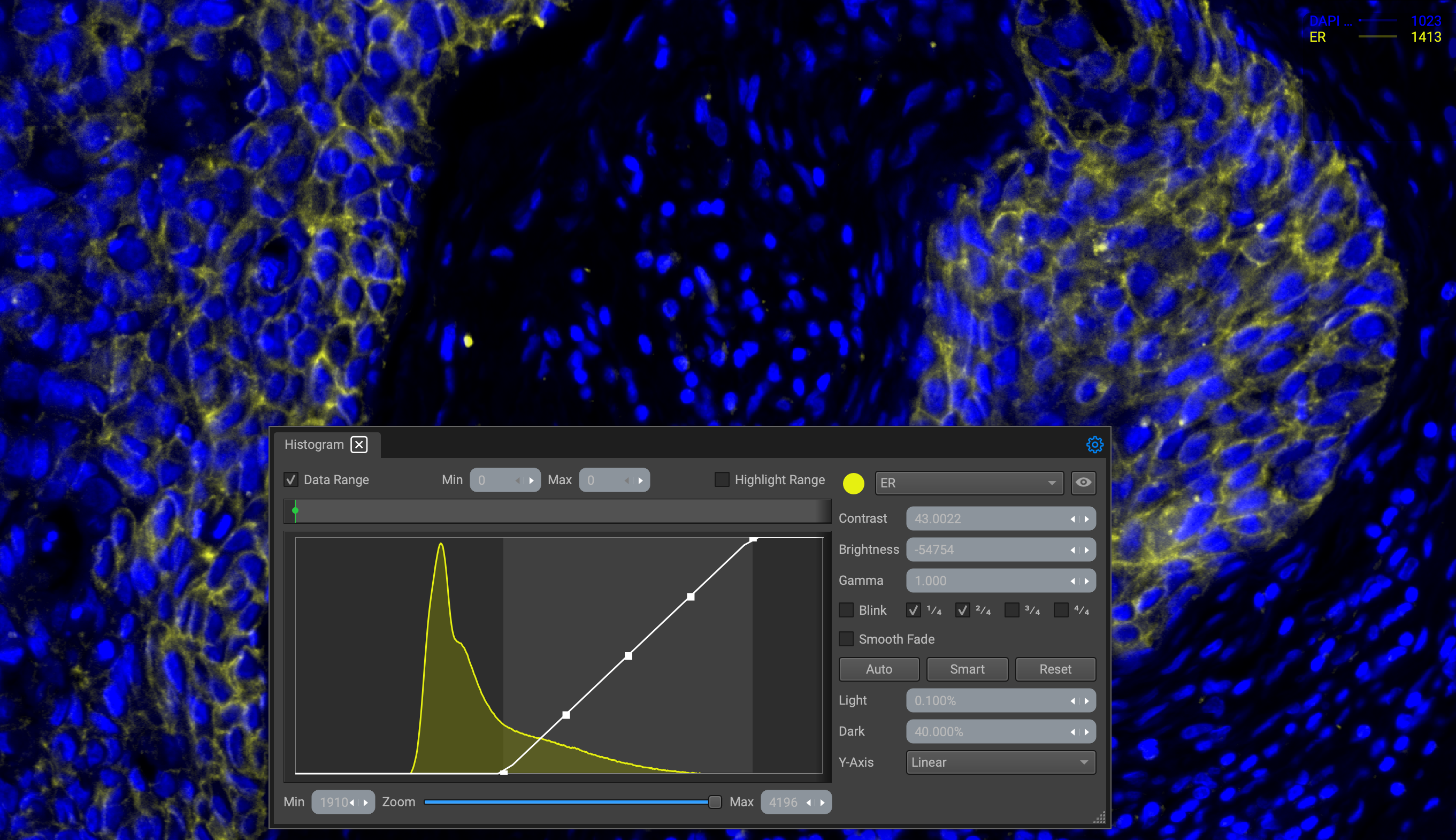
Check the "Data Range" box to unlock the bar. Adjust the range by dragging the green (minimum) and red (maximum) marks directly above the curve.
Blink Effects
The "Blink" and "Smooth fade" features provide the user with rudimentary animation controls. This is an extremely useful feature when displaying many combinations of channels at once and creating multiple perspective combinations.
Selecting the checkboxes next to the Blink function will control the blink intervals, so you can customize blinking effects when visualizing or creating scenes for a sequencer movie that can later be exported.
The blink intervals function like musical bars; 4 checkboxes constitute a 4 beat whole. You can change the duration of the blink by changing the note (checkbox). For example, selecting all 4 checkboxes will create a whole blink (4 beats), and selecting just the 3rd checkbox will create a quarter blink on the 3rd beat.
You can toggle the blink effect for a channel multiple ways:
- Check the "Blink" checkbox in the Histogram widget.
- Right-click the channel name in the legend and check "show effect".
- Check the "Blink" checkbox in the Properties widget under light settings.
Note that you can only customize the blink intervals and toggle the smooth fade transition in the Histogram and Properties widgets. Right-clicking the channel name in the legend will only apply the blink effect set in place for that channel.
Below are examples of both normal and slow fade blinks:
Y-Axes
Linear Scale
Linear scales are most effective for displaying datasets with values spread evenly across a given range. It is less practical when data points consume a larger dynamic range.
Logarithmic Scale
Logarithmic scales are most effective when graphing parameters with a wide dynamic range., which is often the case when plotting fluorescent flow cytometry data to delineate heterogeneous populations of cells.. A log scale is based on exponential differences between values. Consecutive graduations along an axis represent equal changes in ratio.
Logical Scale
The logical scale avoids problems encountered with logarithmic scaling of data when primary measurements and/or compensated data include very low and negative values. The inverse hyperbolic sine function (sinh−1) offers attractive features as a scaling function in that it gives a near-linear region above and below data zero, near-logarithmic behavior at high data values, and a narrow but very smooth transition from one to the other.