Workflow Editor
The Workflow Editor provides a visual schematic of gates, plots, and cluster groups. Each node within the diagram can represent any one of these, each with inputs and outputs. You can create feature plots or gates within the workflow editor itself, or from their respective widgets.
This editor is an extremely useful tool to seamlessly construct a hierarchy of gates and visualize the list of cell sets and feature plots found in the Cell Selection Overlays window.
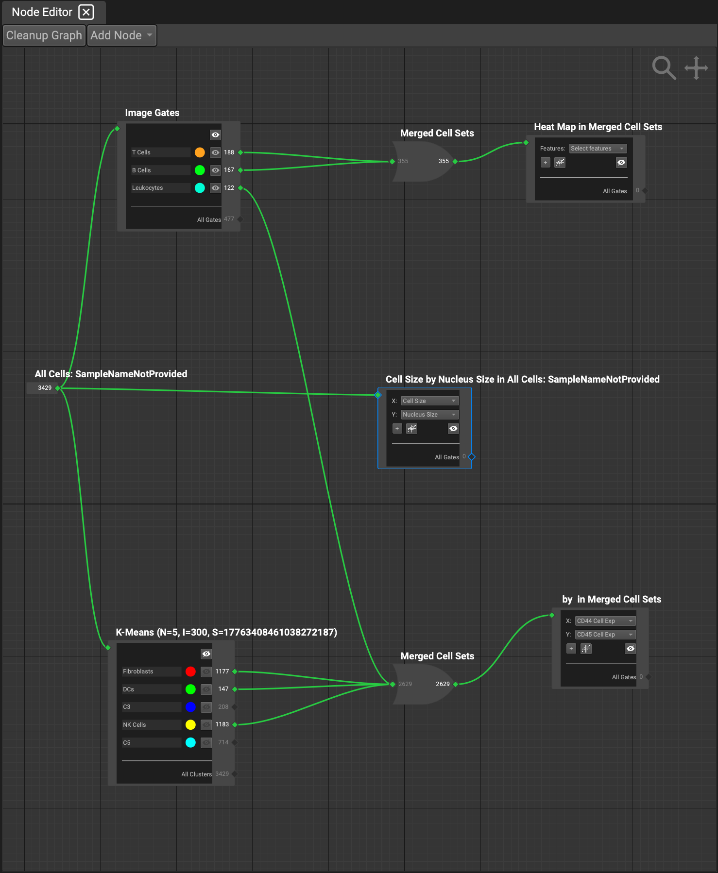
All of these nodes can be connected to each other. The typical hierarchy begins with the segmentation node:
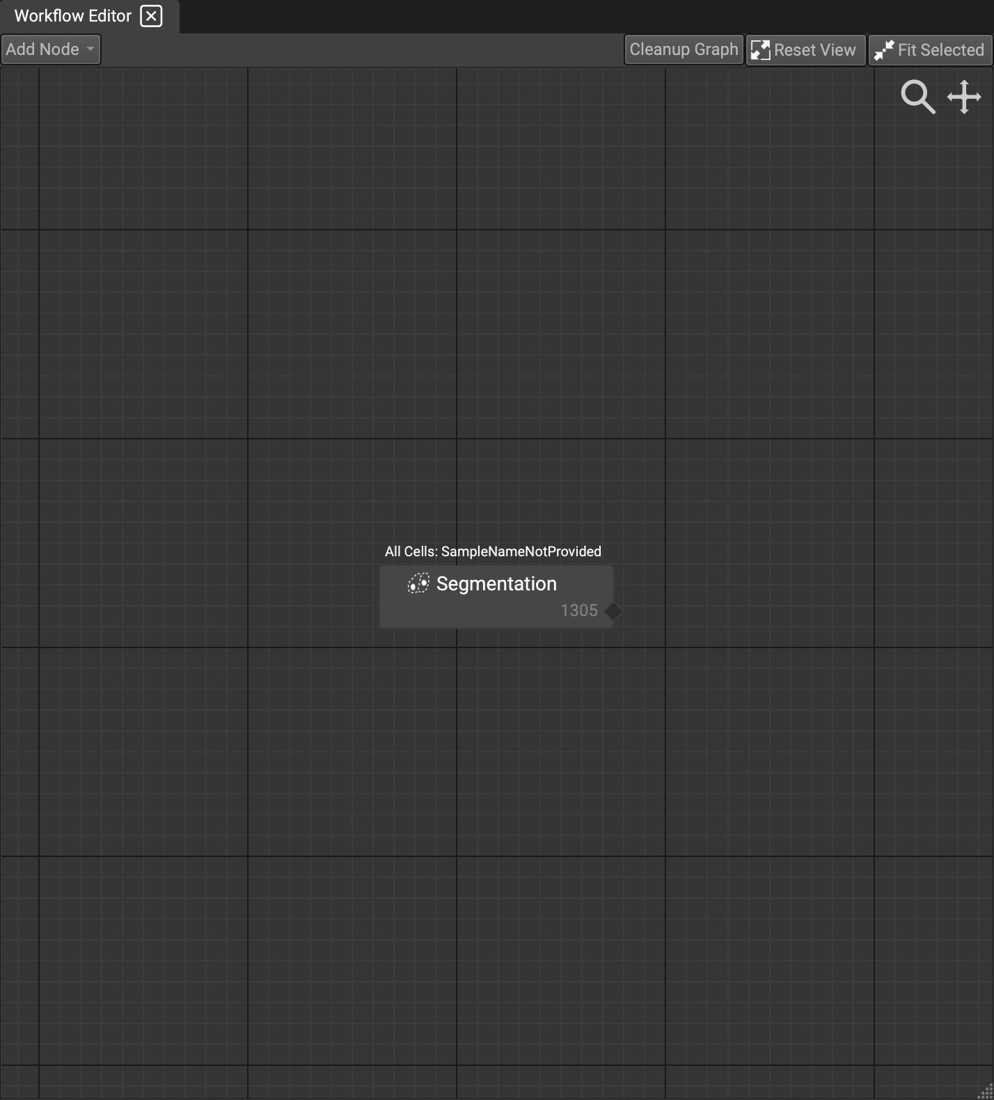
Once you run (or import) a segmentation, this node will appear containing all of the cells. All cell count within a node will appear in the lower right-hand corner. Since this is the initial node to begin constructing your gating scheme, only output is possible. By clicking and dragging the output, you can create a connection to the next conceptual node.
Gating Nodes
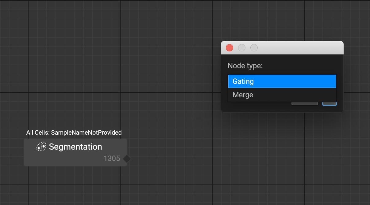
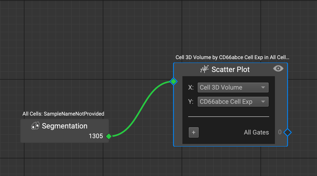
By releasing your mouse, you will prompt a node type dialog, where you can choose which type of node you would like to output to. Since this is our first node, and there are no other cell sets to merge with or from, you must choose a gating type node. Once selected, another dialog will appear with the typical feature plot options that are available to choose from in the Feature Plot widget (Histogram, Scatter Plot, Heatmap, Strip + Violin). Then simply select which features and click OK.
As soon as the node is created, the plot is saved and an entry in the Cell Set Overlays widget will appear. You can interact strictly with the nodes to construct your gates and plots without having to fetch the other widgets first.
Clicking on the eyeball in the upper right-hand corner will bring the Feature Plot widget to the front and display that specific node's plot.
Click on the "+" in the lower left-hand corner to apply a gate to the plot. Once clicked, all of the gating tools will appear in a dropdown. Select the one you would like, and the feature plot (if not displayed already), will appear with the gate applied. Then simply adjust the gate to your liking.
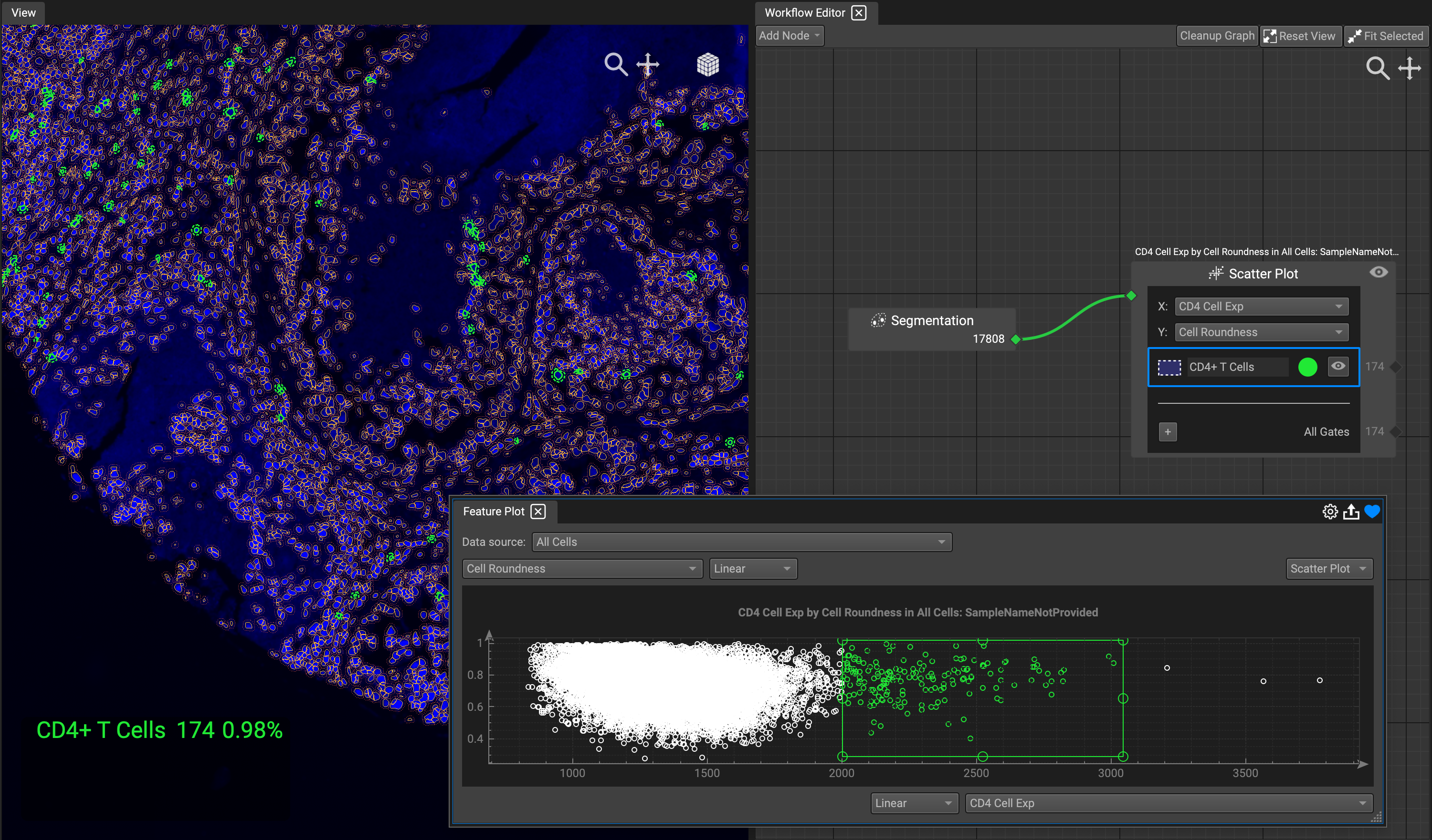
The generated gates in the node will appear directly below the listed features, with a color and eyeball toggle to trigger the display on the Image View. The cell count will also display beside the eyeball for each separate gate, as well as the total for all of the gates combined.
Merge Nodes
The other type of node you can create is the merge node. You can utilize this to form unique cell sets to gate from and display. When dragging a line from an output, simply select the merge node type from the dropdown list.
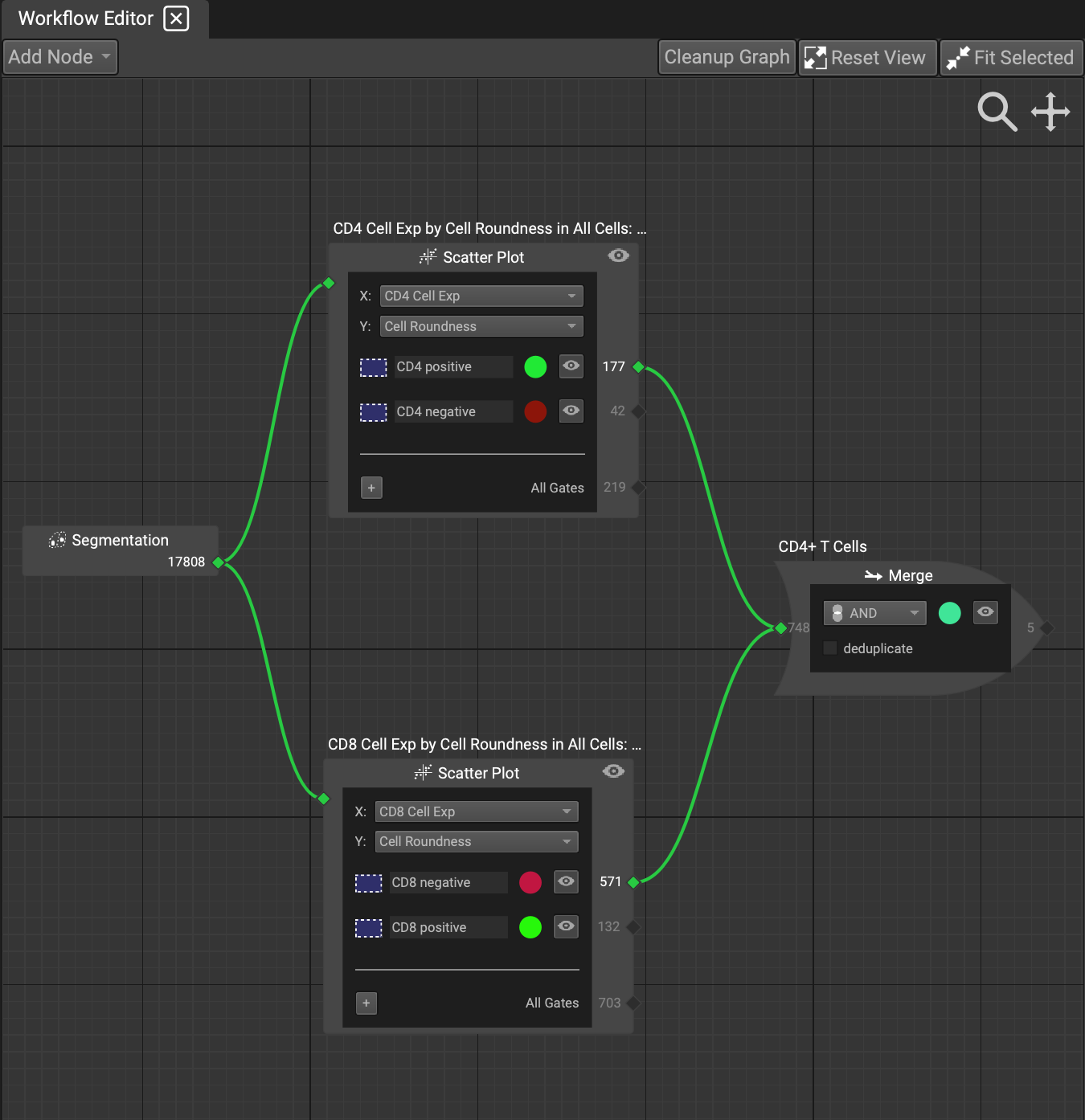
You can drag output nodes from as many listed gates within a node to a new merge node. This can be done with any existing gate or merge node. Simply drag outputs to the intended new inputs. If you would like to undo or reconnect a green line to a different node, simply click on the line and release to undo the connection, or redirect it to a new input to create a new connection. As with the other nodes, you can view the cell count in the right-hand corner of the node. The cell count will update downstream instantaneously if any changes are made to the node configurations.
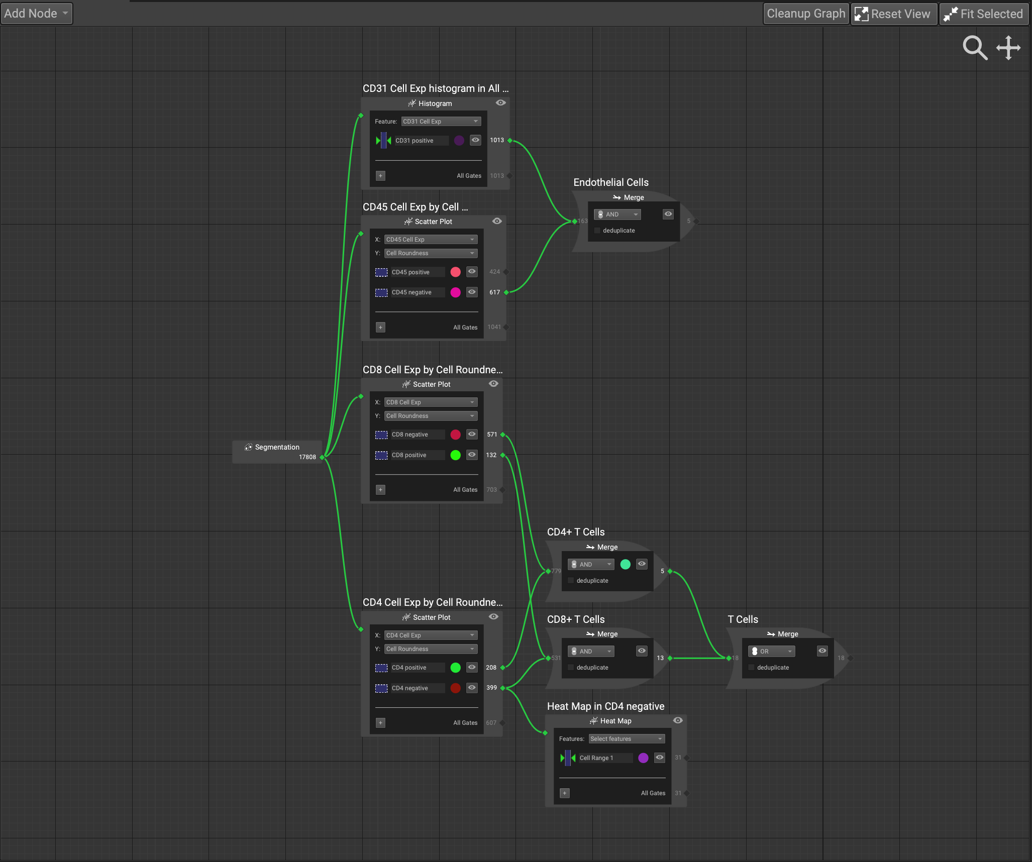
The merge node contains a number of logical connectives you can choose from to precisely isolate your cell sets. In the current implementation, there are AND, OR, and A NOT B.
AND isolates only the cells that are expressed in the intersection of common elements to all sets under consideration.
A NOT B isolates the difference in cell sets, only including cells that are not common to all sets under consideration.
OR includes all of the cells expressed in all of the sets under consideration.
Checking the deduplicate box will include any duplicate cells in the cell set.
Cluster Nodes
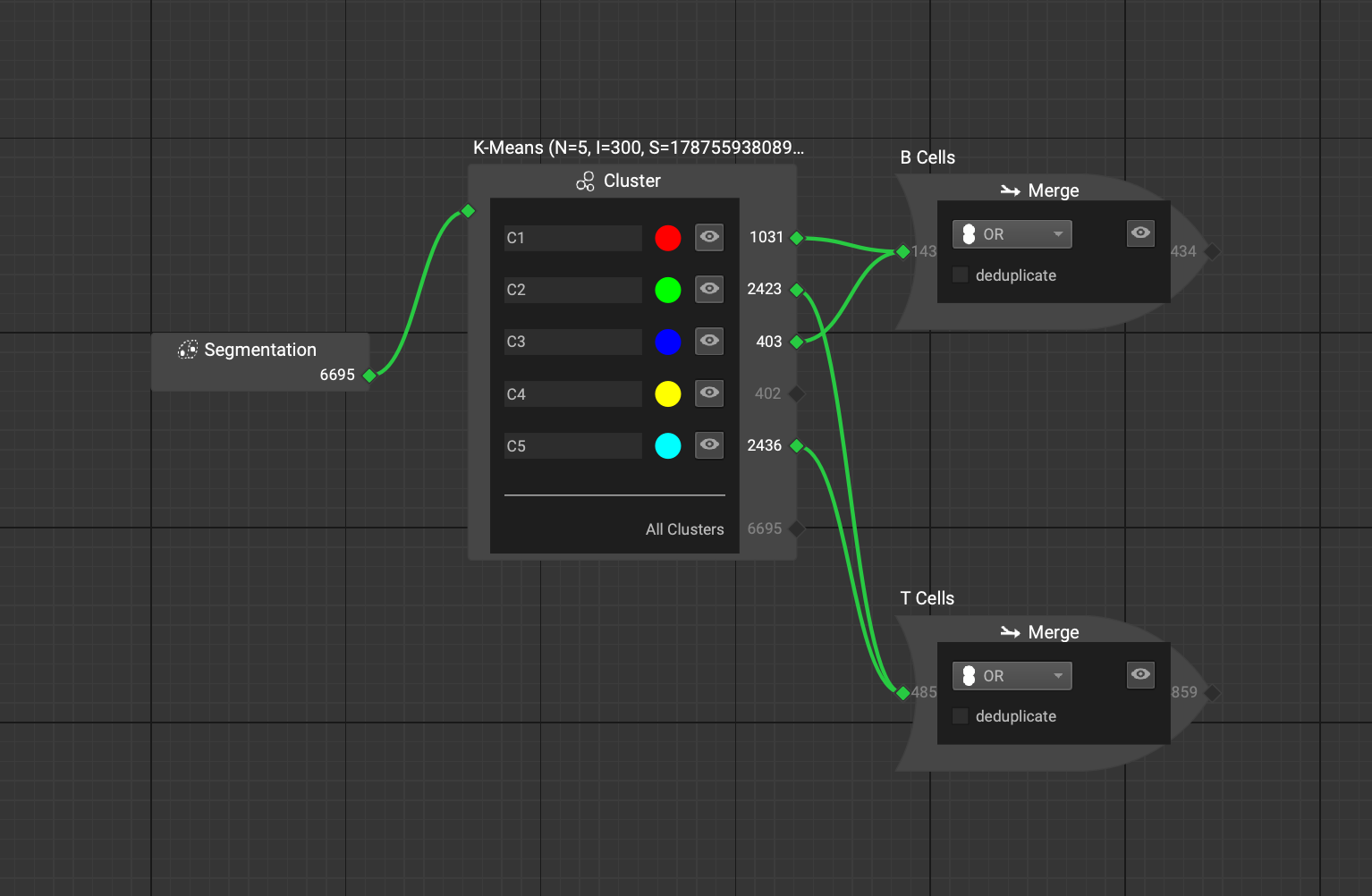
If you run a cluster analysis on a set of features (such as Kmeans) or import your own cluster file, a node will appear with the cluster groups listed. This node will connect to the output of the cell set that is specified as the data source when computed (in the Feature Table). In the example below, it was run on all cells, so it connects directly to the initial segmentation node.
Import Gating Positions and Cell Phenotype Definitions
Importing an entire gating schematic with defined merge nodes is possible through the file menu.
(*Currently still under development and only accessible in Developer Mode).
To do so, navigate to the Phenotyping file menu. Select Import Gate Positions for Phenotyping, which requires an excel file defining your gate positions. Included in the file must be two columns: one containing the name of the cell type, and the second containing the positive or negative marker relationship. This will allow for the automatic construction of merge nodes identifying which marker relationships and combinations indicate your defined cell types.
An example template of such a file looks like this:

Next, you must import your marker thresholds by selecting Import Phenotype Definitions. This file should contain any thresholds you would like to set, which will clamp the marker cell expression using an X-gate on a Histogram plot to isolate the cells that you want for the downstream analysis.
An example template for this file looks like this:

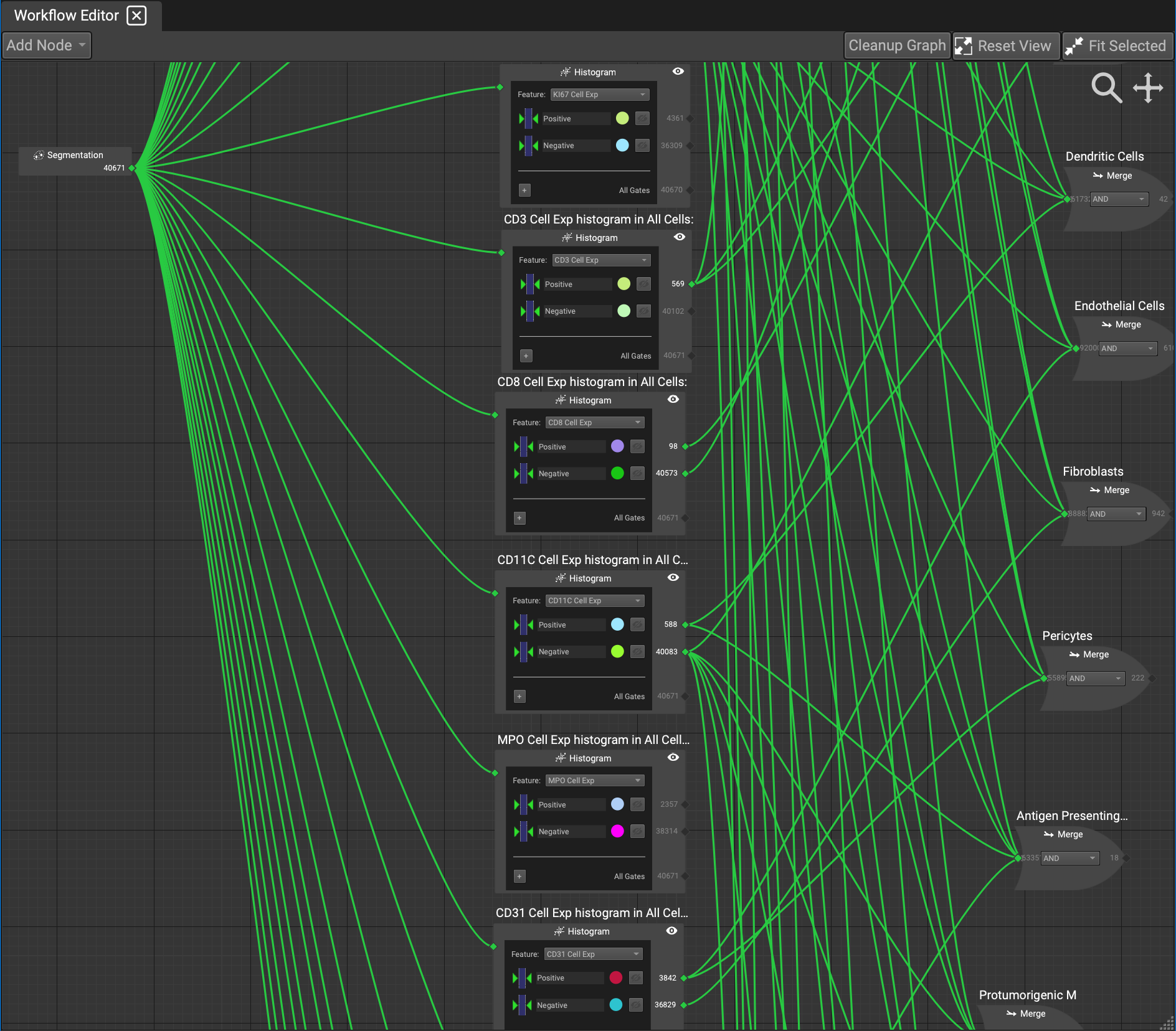
The output will layout your defined cell types in a web of connected gate and merge nodes. Each merge node can then be toggled on or off by clicking on the eyeball in the merge node. In situations where the visual schematic becomes a bit messy, the icons at the top right of the widget can help. Clean up graph will attempt to organize your nodes in a less convoluted fashion. The fit selected button can be useful to quickly home onto a specific node. This can be done when either a node is currently selected, or a gate or cluster in the Cell Selection Overlay list is selected. The Reset View button will center and bring the entire schematic to full view.
Future Reuseable Components
In the near future, there will be more reusable components within the workflow editor. This will including having processing pipeline step nodes, additional clustering methods, image analysis, and procedural listing for the MACSima instrument pipeline with multiple threads. Researchers will also be able to construct a workflow and share it with other researchers.


